Project Progress: Milestone 2
Deep Learning Project Progress Diffusion Image Generation Visualization
- Andrew Lemke & Lakshyana KC
Experiment 1: Visualization of Intermediate Denoised Images
The standard visualization for diffusion models is capturing the image at several points along the diffusion. The visualization appears as noise being removed from some image. While this visualization is nice to look at, it doesn’t clue in to the “magic” happening. The viewers aren’t informed as to how or why the noise is reduced, or how a coherent image is formed from pure noise. One strategy our group tried aims to discover what is present in the noise and model by quickly denoising the image at those intermediate positions. This rapid de-noising attempts to show what information is held in the model and visible noisy image.
Creating the New Visualization
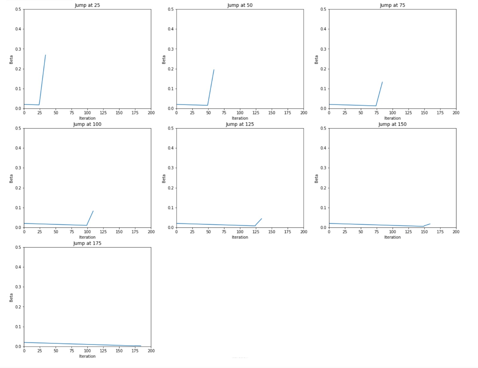
For this visualization, we started with diffusion code from a hugging face blog post. The code covers setting up and training the model. The code outputs the standard visualization as a gif. This blog post uses the MNIST fashion dataset to train the model on as its small size allows for the model to train on systems with normal performance (taking overnight on Google Colab’s GPU runtime). To achieve our ends, we had to rewrite the sampler code to allow more freedom when performing diffusion. The sampling code is what uses the model to create an image from noise. Our new sampler allowed us to totally customize the schedule, which is the constant that affects the rate of diffusion. To see the information held in the model and weights at various points in the diffusion, we used large betas to rapidly denoise the image in a number of steps. To remain fair, we kept the total sum of the betas consistent. Below is the beta schedules for various “jumps,” which are the points where we dramatically denoised the image very quickly.
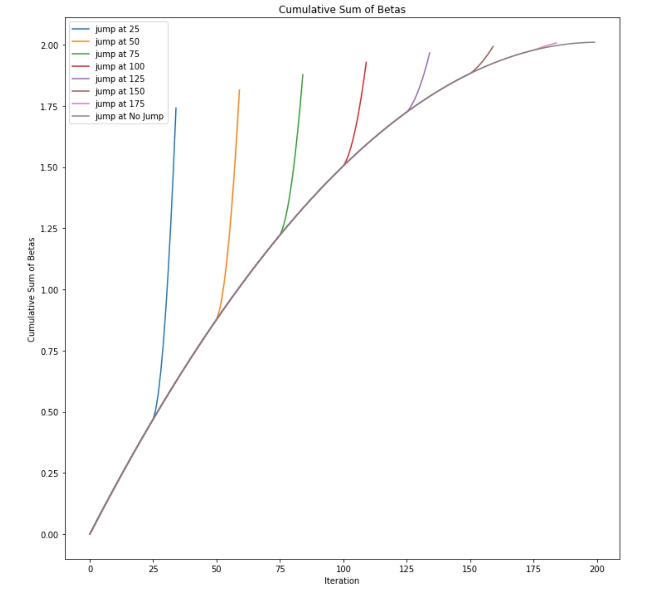
Here are the cumulative sums of the betas for each of the jumps.
These betas produced the following visualizations from the noisy images. To compare this method to the traditional visualization, it is shown below the new visualization for the same seed and model randomness.
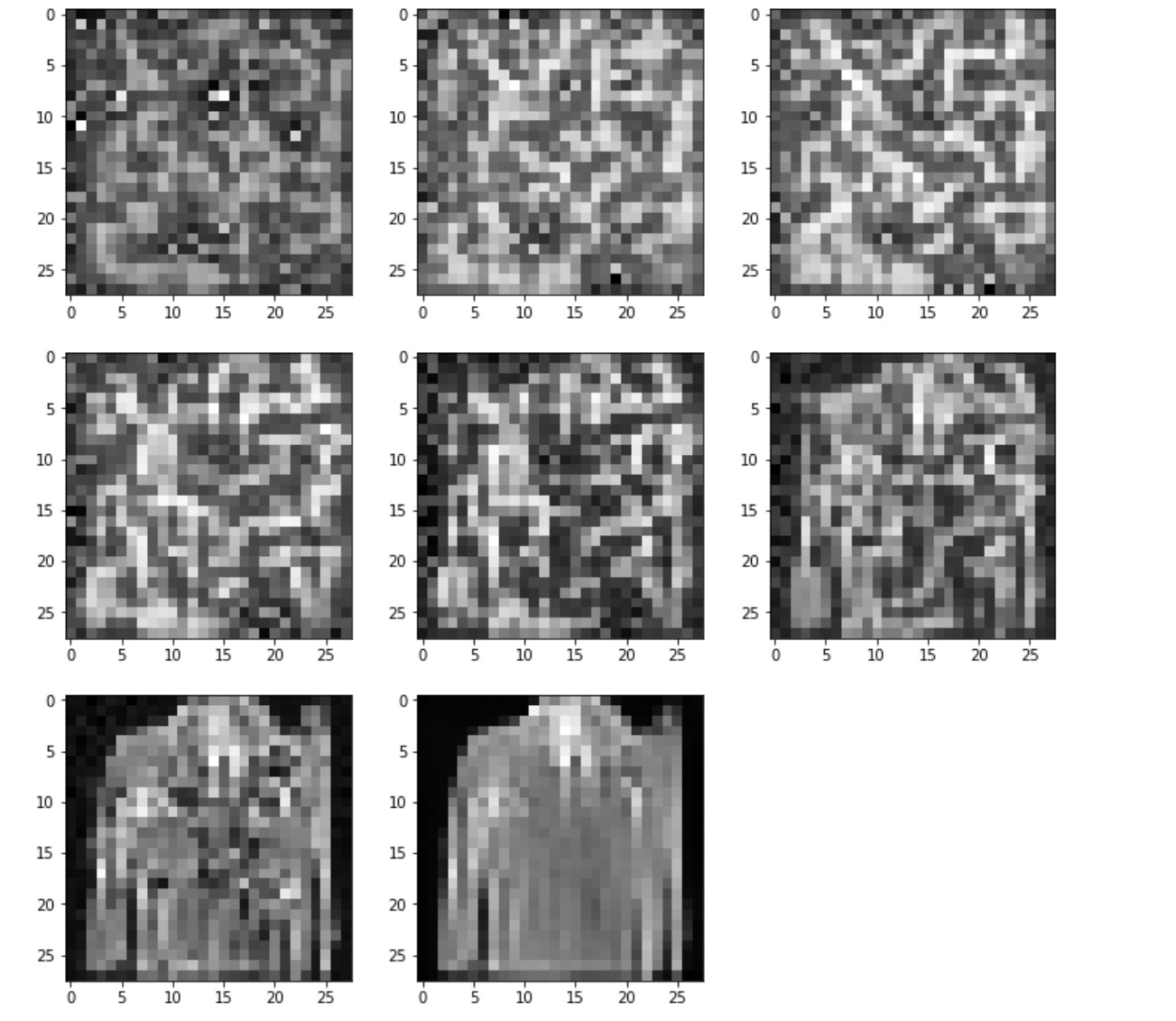
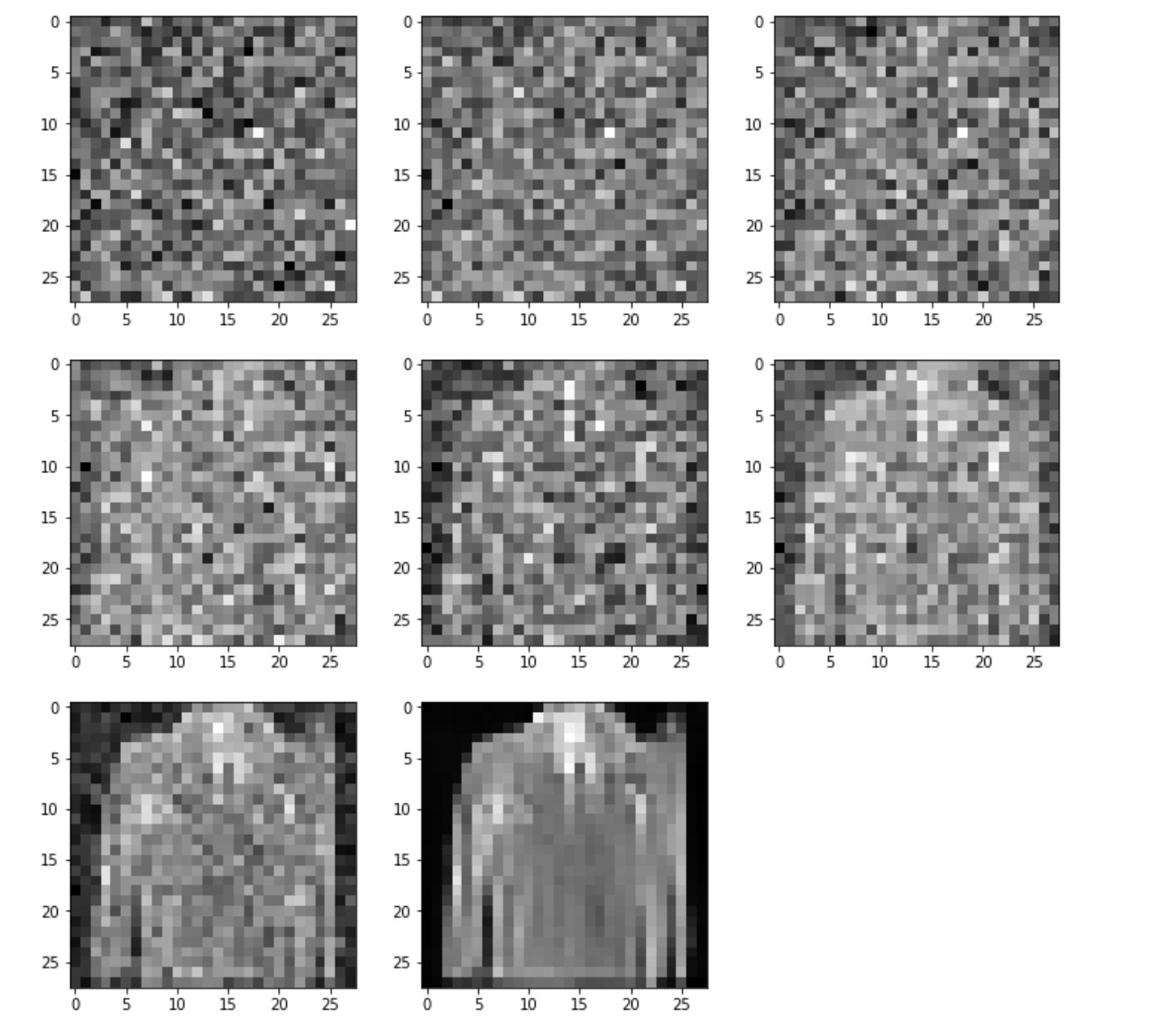
The new visualization shows some features of the output much quicker than the traditional visualization. All of the MNIST fashion pictures which the model was trained on are on a black border. The new method has this black border more prominent than the new visualization. Unfortunately, the new method does not show any large improvement over the traditional method. This could be due to the ultra-simplistic diffusion model created or to flaws in this approach.
Experiment 2: Probing into Stable Diffusion Model's Understanding from Prompt and Model Output Comparision
Stable Diffusion Models represent a major milestone in the progress of text-to-image generation task, with its hyper-realistic rendering and image generation capabilities. Its outputs suggest the model's ability to compose ideas and concepts that cannot simply be picked up from some of the images in the training data distribution. But what is the scope of this model and in what ways can we probe into the image outputs themselves to get a better understanding of the model's performance and limitations from the point of view of understanding of tangible concepts and ideas such common verbs, nouns, quantity and so on.
Inference Outputs
Some of the model outputs from the initial experimentation are shown below.
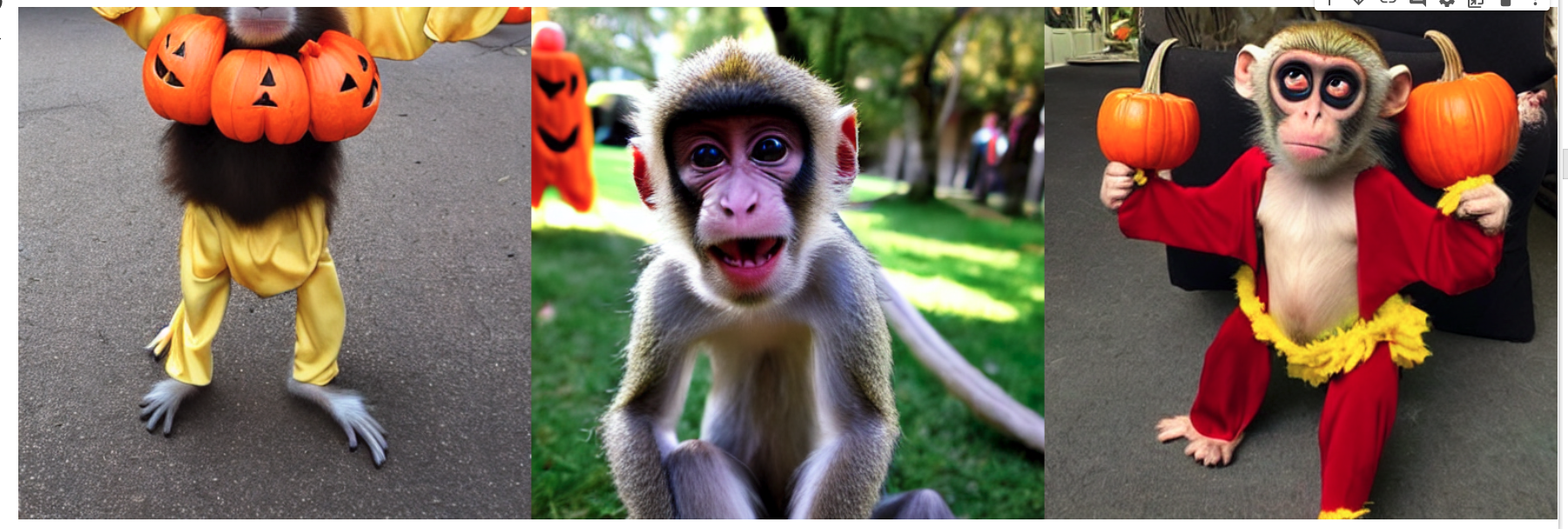
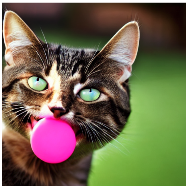
Some of the model outputs from the initial experimentation are shown below.
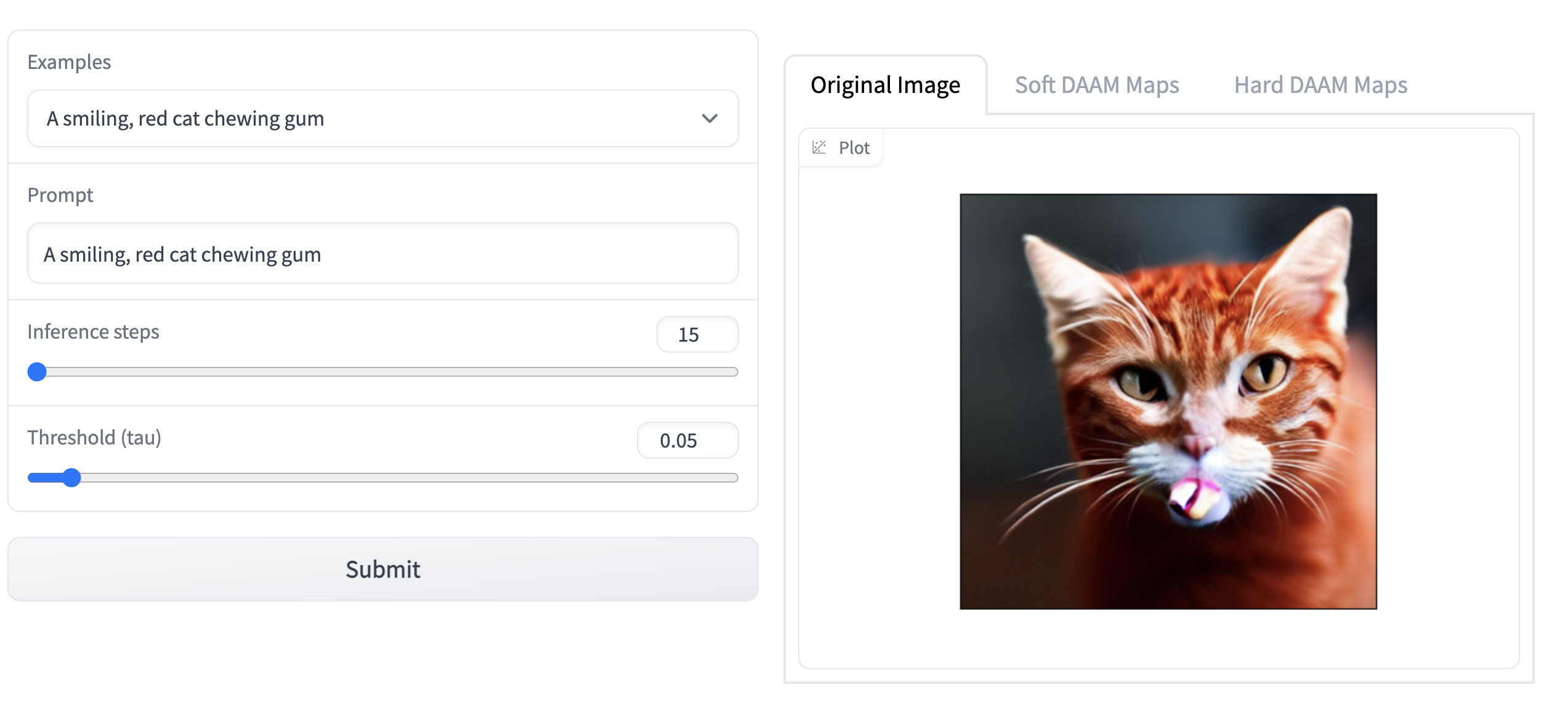
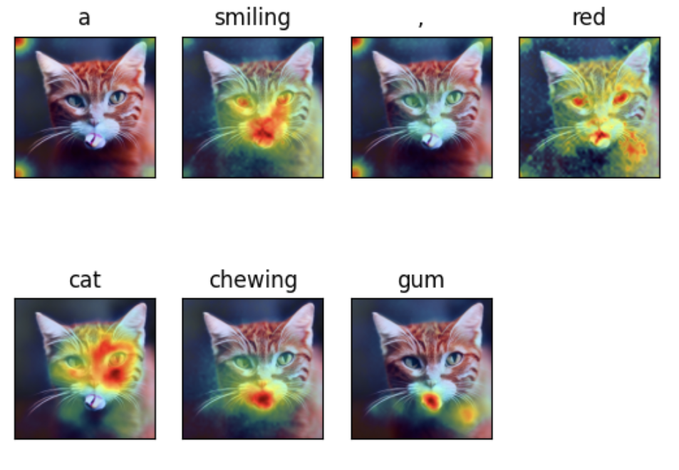
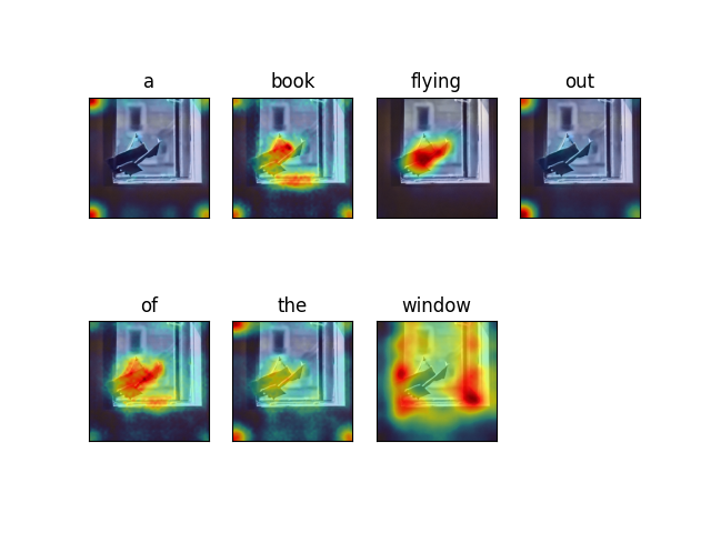
Experiment 3: Visualizing Attention Heat Maps Using DAAM: Diffusion Attentive Attribution Maps
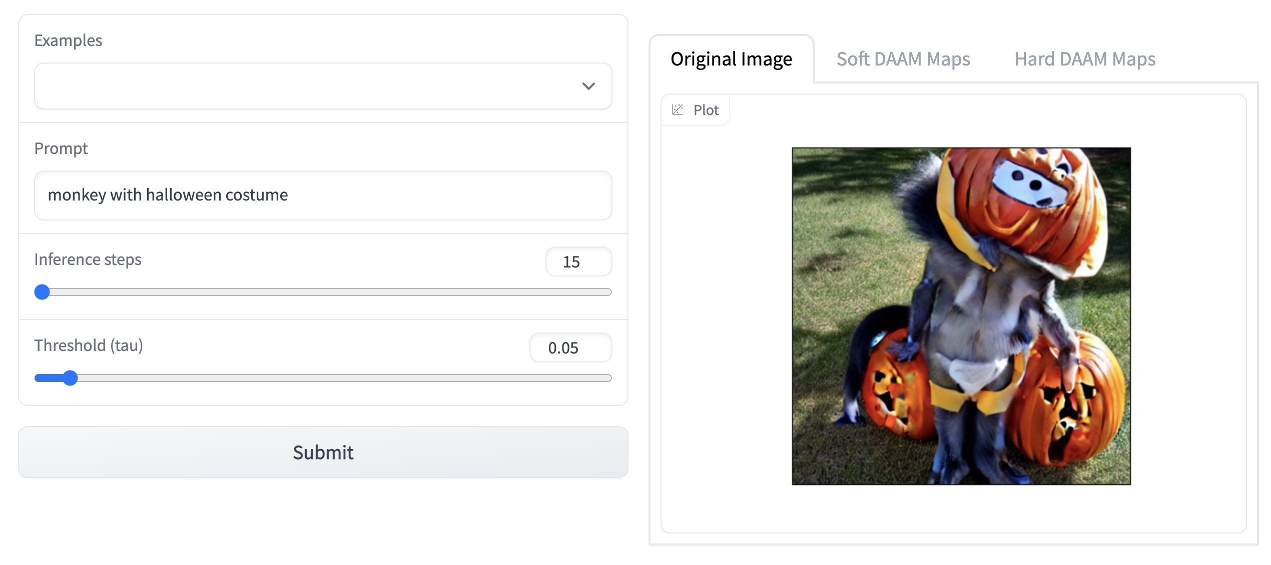
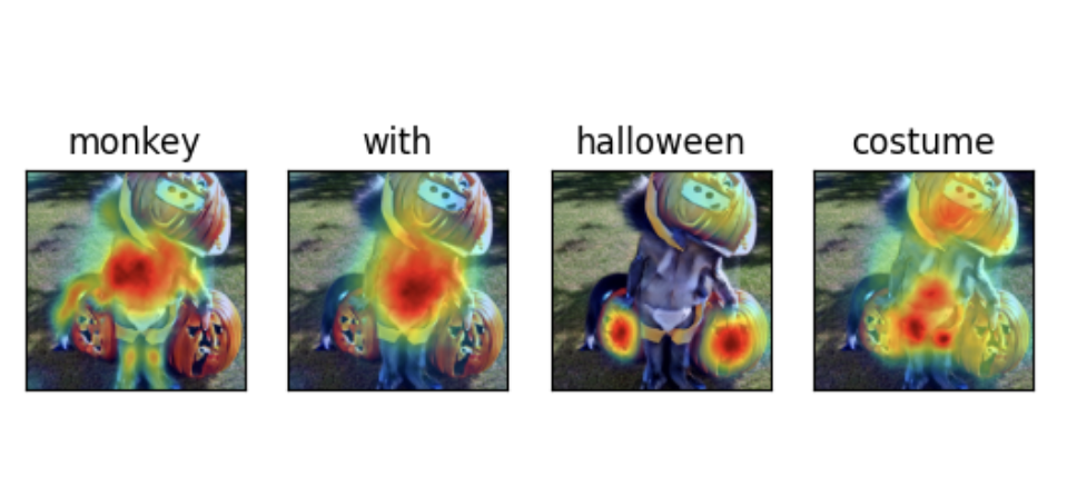
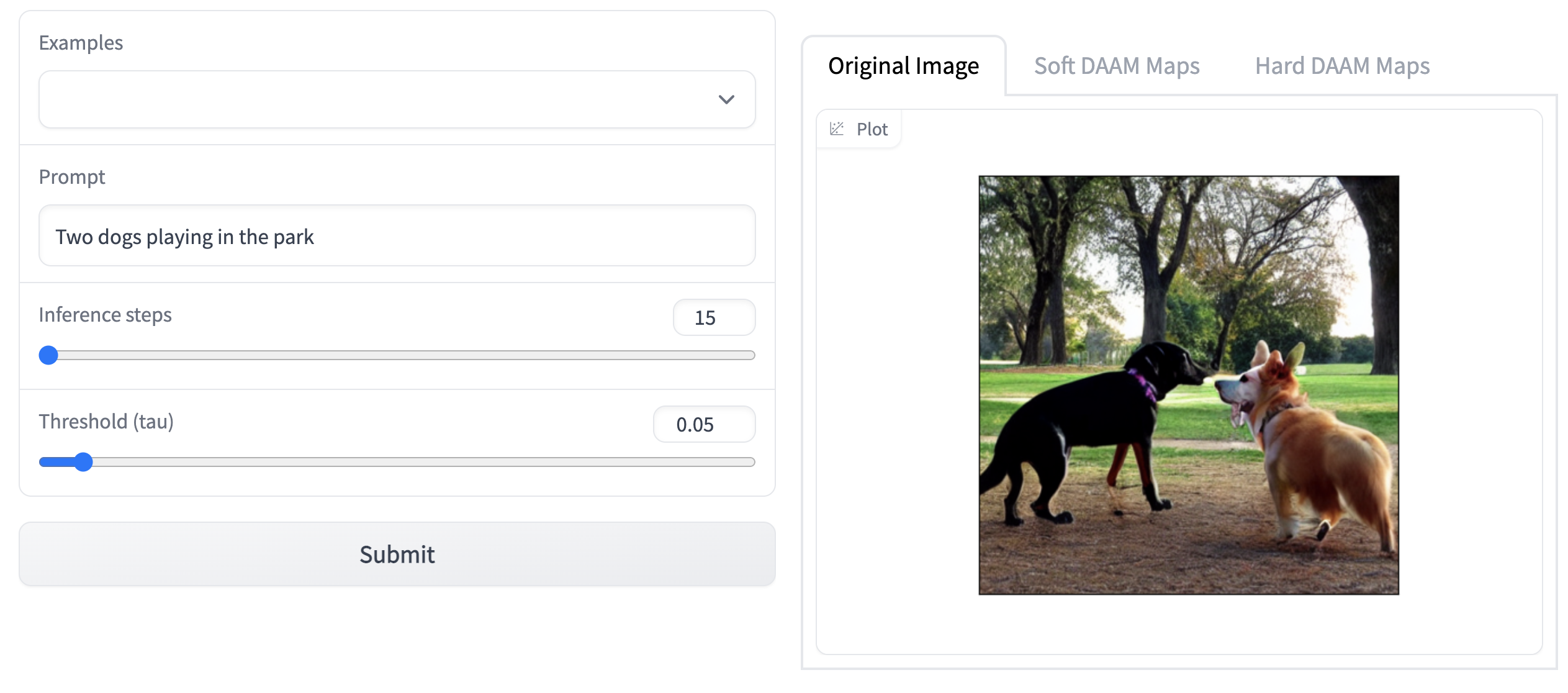
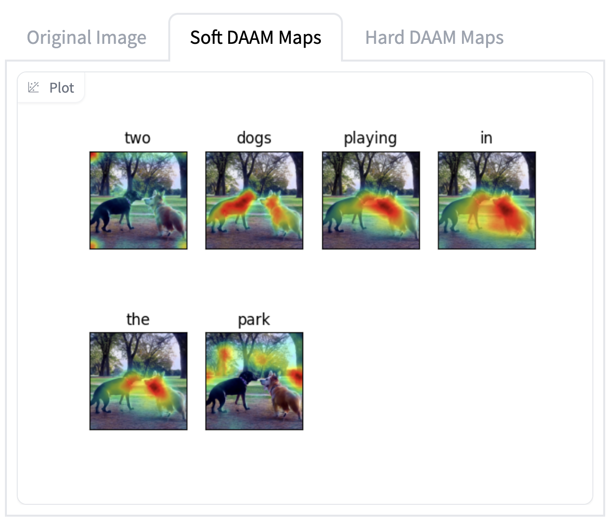
The next part of our experiment was understanding the DAAM: Diffusion Attentive Attribution Maps paper that was motivated by the question: “Which parts of a generated image does an input word influence most?” (Tang R. et al, 2022). To help answer this, and interpret and understand the model, the authors proposed a novel interpretability method using attention heatmap visualization by upscaling and aggregating cross-attention activations in the latent denoising subnetwork. A similar text prompts from experiment 1 were used for visualization to help interpret the model's understanding from the regions of maximum attention.
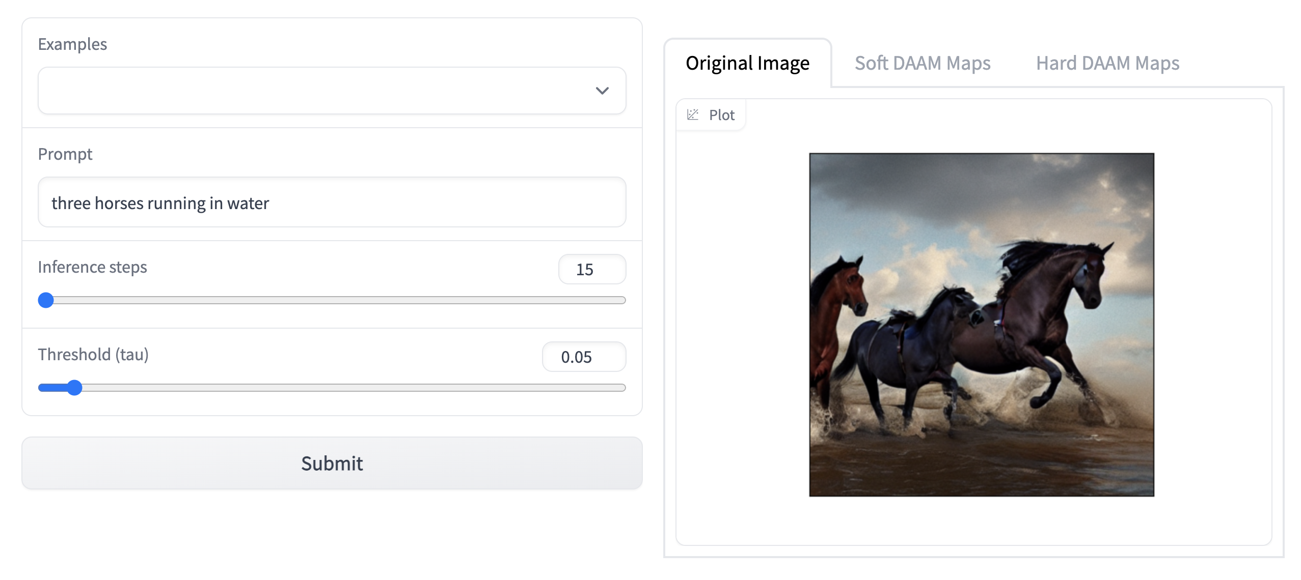
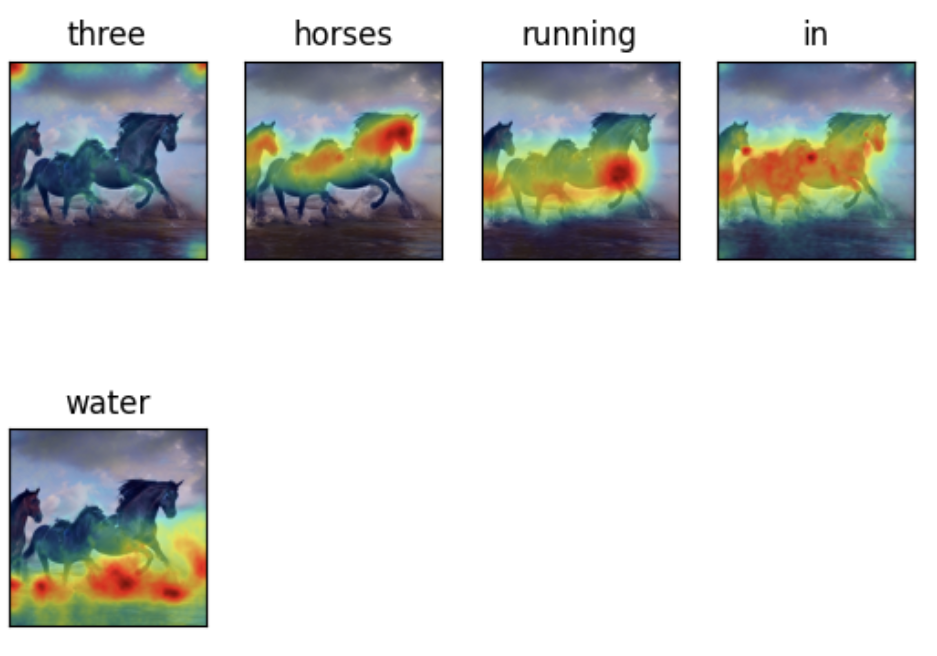
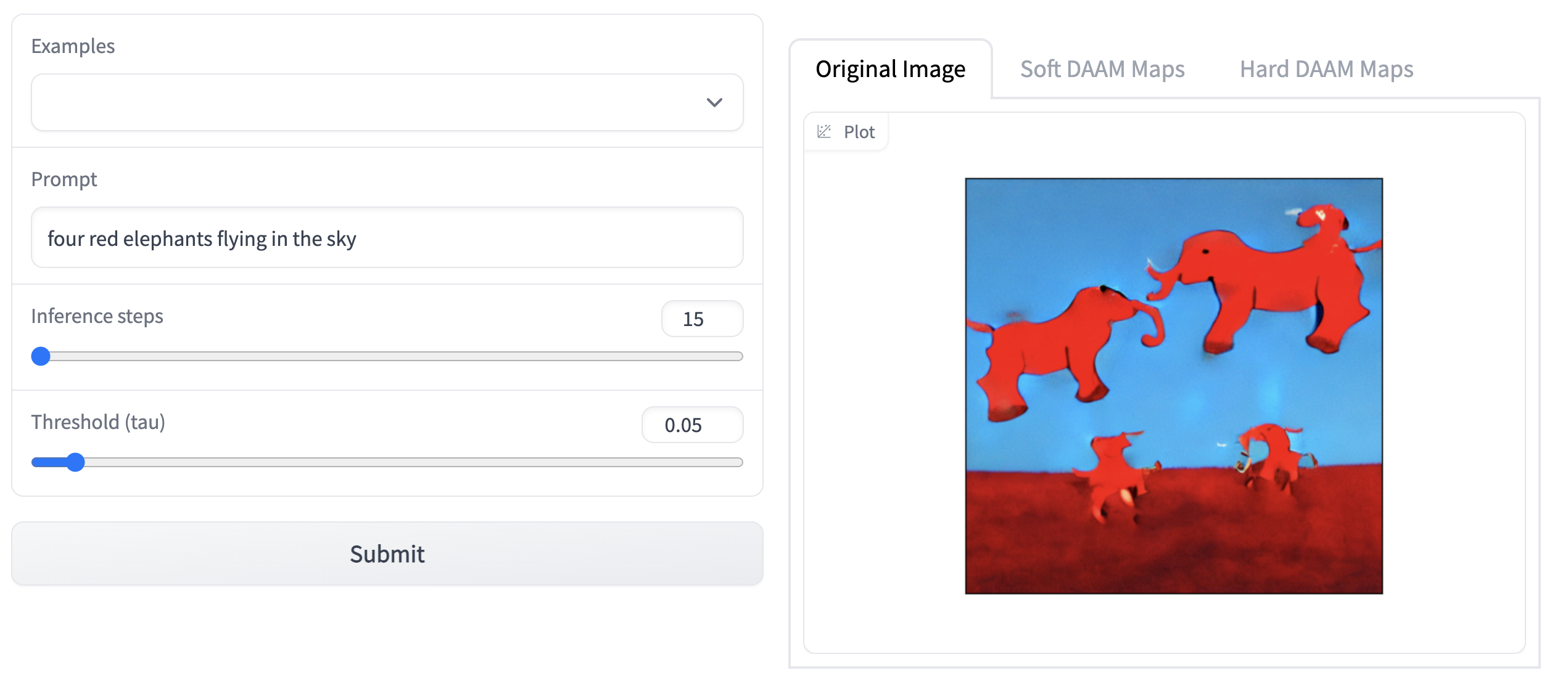
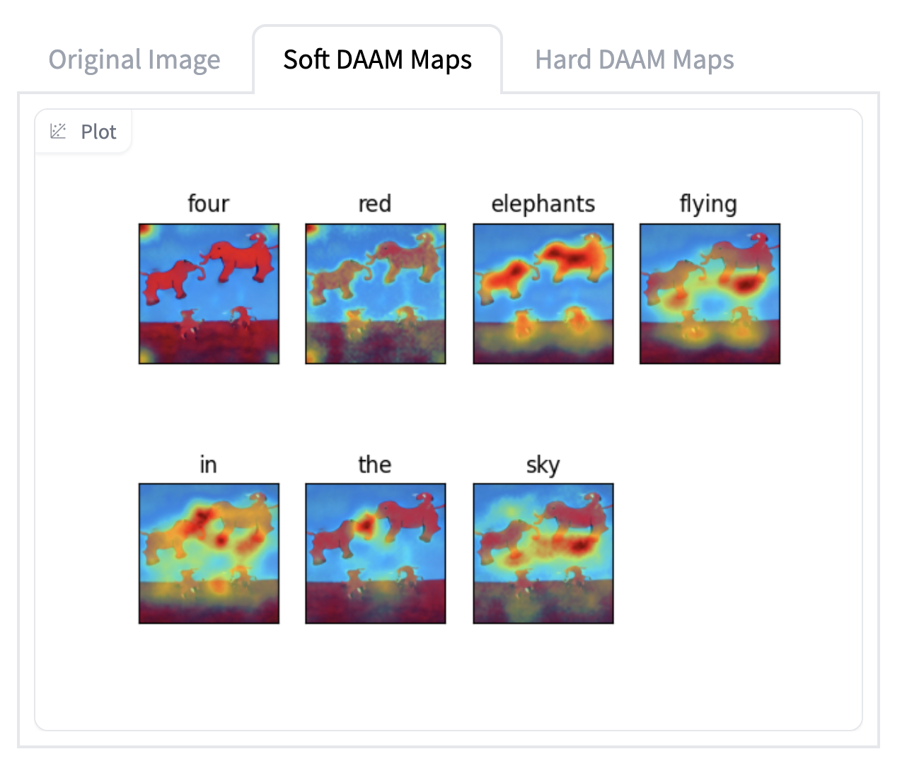
As part of the first step in the experiment, the existing codebase from the cross attention based visualization was modified to run on different text prompts than the ones provided by the authors. The results of this experiment are shown below. Note: Due to the GPU and ram limitations, the model was run on 15 inference steps and 0.05 threshold (tau) value.
Attention Heatmap Visualization Results
Next Steps
We will use a similar strategy with a pre-trained and a fully capable diffusion model for experiment 1. As we have seen from the inference experiments, the Huggingface pretrained model is able to create a diverse set of coherent images in response to the prompt, we hope that it will produce better visualizations under this method. At the very least, trying this method under a known good model will allow us to determine if our visualization method is faulty as we know the model is good. For the DAAM visualization method, we will continue to explore and replicate the paper's approach to probe into the model further before looking for new insights into diffusion models into the limitations and capabilities of the model.